Context menu
Consider the context menu invoked by right-clicking the mouse in free space.
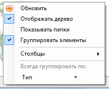
Обновить– updates all the list items by current position -listView1.BuildList(true).Отображать дерево– hide/show the treeView (the propertytreeView1.Visible).Показывать папки– display/displaying a folder in a listView.Группировать элементы– group/don’t group items in a listView (propertyShowGroups).Столбцы– choose columns to display in the listView. Column» «Name is always displayed.Всегда group по– choose the column that will always be group items (propertyAlwaysGroupByColumn).
Grouping desktop items
Grouping is specified by the property ShowGroups (default true).
The column to group by default is determined by the column that the ordering of the elements. A group name takes the value of this column from the corresponding element.
For example, if all elements have different names, then sorting by name will display as many groups as all items in listView, each group will have one element. The group name will take the name of the contained element.
You can specify the column by which grouping will occur always, even if sorted by another column. For this is the attribute AlwaysGroupByColumn (default null), it is assigned a corresponding column.
An example of grouping of items on the desktop
listView1.ShowGroups = true;
listView1.AlwaysGroupByColumn = this.ItemType;

Replacement of icons of the list items
If you are not satisfied with the standard icons for folders, custom forms and edit forms, replace them as follows:
-
Replacement of the entire group of icons. In the instance of the class
Runnerbox for picturesimagecacheshould benull(is the default). Then the picture is taken fromimageListRunnersandimageListRunnersLarge(to display small (16x16) large (32x32) icons, respectively). As the key uses the following values: IconFolder– folderIconForm– custom shape,IconEdit– editing formIconFolderUp– to level up.
In a custom application icon changes using the same name field of the component DesktopCtrl, except IconFolderUp – here it can not be replaced.
- Replacement icons for the specific instance of the class
Runner(custom form or edit form). The replacement happens in the code of the user application.
Example (ЛюдиDesktopCustomizer.cs)
public override ICSSoft.STORMNET.UI.Runner[] GetRunners()
…
arr.Add(new ICSSoft.STORMNET.UI.ContRunner(typeof(IIS.Люди.Л_ЧеловекL), "People", "Man", "A description of the man"));
arr.Add(new ICSSoft.STORMNET.UI.ContRunner(typeof(IIS.Люди.Л_МашинаL), "People", "The machine", "Machine description"));
arr.Add(new ICSSoft.STORMNET.Windows.Forms.FormRunner(typeof(IIS.Люди.WinformForm), "People", "Form", "Form description"));
…
// *** Start programmer edit section *** (People GetRunners() End)
((ICSSoft.STORMNET.UI.ContRunner)arr[0]).SetImage("D:\\images\\goldstar3.png"); // "Person"
((ICSSoft.STORMNET.Windows.Forms.FormRunner)arr[2]).SetImage("D:\\images\\caseberrytmcut.jpg"); //"Form"
// *** End programmer edit section *** (People GetRunners() End)
Update ListView
There may be situations where adding, modifying or deleting any objects in ListView some elements are not displayed correctly. Then ListView need to update force. For this purpose the following methods:
BuildList– rebuild all items in the listView. True as argument means that you need to maintain focus and selection.RefreshOverlayto update the overlay, in particular the picture (passed argument).RefreshObjectto update the row with the passed in argument object.RebuildColumnsto update existing columns. Is called, for example, after modifying the propertiesIsVisiblecolumn.
Working with Column and Item
The component ObjectListView there are some features you configure and add columns and records. First of all you need to say a few words on the support class ItemInListView.
Class ItemInListView in fact links Items with Columns. ObjectListView itself creates a new item and assigns each field to the desired value. To be unambiguous compliance «field in ItemInListView – column in ObjectListView» field names in ItemInListView match the value fields AspectName (type string) in their respective columns.
The addition of a new item occurs according to the scheme:
- Create an instance of the class
ItemInListViewand filled its fields. - Add it to
ObjectListViewmethodAddObjectsfor multiple item orAddObjectfor one item.
With this approach there is no need to work with the subitem’s and attached to each item can be referred to as ItemInListView:
((ItemInListView)listView1.SelectedObjects[0]).Description
When creating columns, you need to specify AspectName to communicate with and ImageAspectName to communicate with the picture. To add columns you need in two arrays.
An example of setting of columns
listView1.AllColumns.Add(Caption);
listView1.AllColumns.Add(Description);
listView1.AllColumns.Add(ItemType);
listView1.AllColumns.Add(ParentFolder);
listView1.Columns.AddRange(new System.Windows.Forms.ColumnHeader[] {
    Caption,
    Description,
    ItemType,
    ParentFolder});
Event TreeViewItemSelected
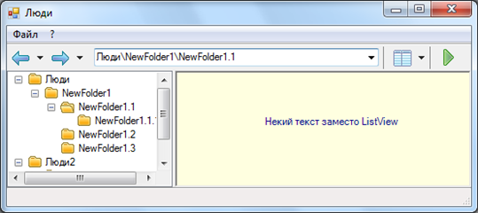
Event TreeViewItemSelected happens with the re-election item in the treeView. Allows, under certain conditions, replace the listView with some of their controls. For example, if selected in the treeView the node is a leaf, i.e. it has no forms and tables, but only the folder (see the property IsListNodeSelected) instead of listView show text with background information.
In your application, you need to subscribe to an event TreeViewItemSelected instance DesktopCtrl. In an inherited class TreeViewShowControlsEventArgs need to set this value to true field Handled if you want to display your controls and false if you want to display a listView. Further, controls are created and placed in PanelOnListView.
Example of setting selection items
private void desktopCtrl2_TreeViewItemSelected(object sender, ICSSoft.STORMNET.Windows.Forms.DesktopCtrl.TreeViewShowControlsEventArgs e)
{
    if (this.desktopCtrl2.IsListNodeSelected)
    {
        e.Handled = true;
        Label label = new Label();
        label.Text = "Some text instead of the ListView";
        label.AutoSize = true;
        label.ForeColor = Color.DarkBlue;
        label.Location = new Point(100, 50);
        e.PanelOnListView.Controls.Add(label);
        e.PanelOnListView.BackColor = Color.LightYellow;
    }
    else
    {
        e.Handled = false;
    }
}
DesktopSettings
Seriousely class DesktopSettings is used to store user settings such as window size, column width, columns displayed, etc. in order to setup has been loaded, you need to set the property UseSettings class SettingManager is true. In this case, settings are saved before closing the user application, and loaded when you start.
Stores the following settings:
- string[]
History- the story line inAddressBar. - string
curpath- current path in folders. - int
Viewmodemode of presentation. 0 – large icons, 1 – list, 2 – detail, 3 – small icons. FoldersSplitterPosint - the position of the splitter between the treeView and the listView.- bool
TreeViewVisible– display the treeView. - bool
ListViewShowFolders– show folders in the listView. - bool
ListViewShowGroups– group items in the listView. ListViewAlwaysGroupByColumnnamestring – name of column on which you want to always group items (Caption- name,Description,ItemType- typeParentFolder- folder).ListViewColumnSortstring – the name of the column that sorts the listView items.- PstrfListViewSortOrder` SortOrder – the sort order of the listView items order (descending, ascending).
- Display columns:
ColumnDescriptionVisible,ColumnItemTypeVisible– typeColumnParentFolderVisible– folder. Column» «Name is always displayed. The width of the columns:ColumnCaptionWidth- name,ColumnDescriptionWidth,ColumnItemTypeWidth- typeColumnParentFolderWidth– folder.
Desktop shortcuts
The mechanism of labels allows you to work with instances of data objects from the desktop.
Labels should be applied, if in any instance it is necessary to work very often. It will not load the list form and do not look for instance at her.
Labels can be applied to an instance of any class that is the successor ICSSoft.STORMNET.DataObject.
Folder for shortcuts
The folder in which you can create labels can be specified by overriding a method GetShortCutFolders() class DesktopCustomizer. This method returns an ArrayList whose elements are strings that specify the full path to the folder. By default, this method returns only the folder favorites» qmo.
Example folder for shortcuts
public class NewDesktopCustomizer : ICSSoft.STORMNET.UI.DesktopCustomizer
{
  …
  public override System.Collections.ArrayList GetShortCutFolders()
  {
      System.Collections.ArrayList arr = base.GetShortCutFolders();
      arr.Add("NewFolder");
      return arr;
  }
  …
}
The name of the shortcut
When you create a shortcut by default takes the name of a list form. To assign a label adequate name, do the following: The class of the corresponding object, you need to mark an attribute ShortCutCaption. Setting this attribute is the name that will appear with the label. In the name of the shortcut you can specify @name@ where name is the name of a property or field of this class, then the name of the label instead of this design will be substituted the value of the specified property or field of the corresponding data object.
Example specify the name of the label
[ShortCutCaption("A cat by nickname @Nickname@")]
public class Кошка : ICSSoft.STORMNET.DataObject
{
        …
        public virtual string Кличка
        {
            get
            {
                return this.fКличка;
            }
            set
            {
                this.fКличка = value;
            }
        }
        …
}
As a result, the name of the label for the data object «Cat» will, for example, «a Cat named Murka».
Runners
Runner – a class that implements the methods for running a label. In the designer, a runner takes a shortcut. To add a new runner, you need to create a new class that are inherited from DesktopShortCutRunner. The methods of the runner, marked RunnerMethodAttribute can be started from the context menu of the label, with this type of runner. The attribute parameter is a string that will be displayed in the corresponding item in the context menu of the shortcut. In the base class DesktopShortCutRunner implemented two standard methods:
RunEditForm– launch the edit form. A parameter is passed the name of the type editing form.RunObjectMethod– Start method of the object. A parameter is passed the name of the method.
The second parameter of both methods can be passed the name of the view to load the object (this option is not mandatory, but in some cases its absence may lead to errors). In runner, you can specify default picture labels with the given type.
How to use runner for labels
Runner, who will run the shortcut that is automatically defined when you create the shortcut. In order for a runner used to label objects of a particular type, do the following:
- The runner GetObjectTypes implement a static method that returns an array of types for which you want to apply data runner.
- Override method GetShortCutRunners() class DesktopCustomizer. This method returns a dictionary whose key is the class name of the runner, and the value is an array of supported types of objects that the method returns GetObjectTypes().
By default, this method returns only runner for the report (ReportRunner).
An example of a runner for labels
public class NewRunner : DesktopShortCutRunner
{
        …
        public static Type[] GetObjectsTypes()
        {
            return new Type[] { Type.GetType("ICSSoft.STORMNET.MyType, MyTypeAssemblyName") };
        }
        …
}

public class NewDesktopCustomizer : ICSSoft.STORMNET.UI.DesktopCustomizer
{
        …
        public override Dictionary<string, Type[]> GetShortCutRunners()
        {
            Dictionary<string, Type[]> shortCutRunners = base.GetShortCutRunners();
            shortCutRunners.Add("ICSSoft.STORMNET.NewShortCutRunner, NewShortCutRunnerAssemblyName", NewShortCutRunner.GetObjectsTypes());
            return shortCutRunners;
        }
        …
}
Create a label from code
The label is created by calling the static method CreateShortCut. The method takes the name of the shortcut, the path to the folder in which to display the label, the type of runner, a data object corresponding to the label type edit form and picture to display the shortcut. If this parameter is null, the label will be displayed by the default picture. Another optional parameter specifies whether the created shortcut, common or not. If the label is common, it is in a database in the User field will be null in the future it will be seen by all users. If the label is not shared, in the database the label will remain with the current user.
Status button of the folders on the desktop
In the toolbar of the desktop there is a button Свернуть/deploy папки. To display it you need to attach the property Operations control desktop value DesktopOperations.TreeExpandCollapse. The easiest way to do this in the Main method forms the desktop.
static void Main()
{
  try
  {
  ...

      КошкиИЛапыDesktop desktop = new КошкиИЛапыDesktop();

  ...

      desktop.desktopCtrl2.Operations = DesktopOperations.TreeExpandCollapse;
      Application.Run(desktop);
  }
  catch (System.Exception e)
  {
  ...
  }
}
The picture on the desktop
The background picture of the desktop set by the property listView1.OverlayImage.Image. You can choose any picture formats gif, jpg, jpeg, bmp, wmf, png. You can set an animated image, but to animate it will not. After changing image will need to update the method call RefreshOverlay:
listView1.RefreshOverlay(listView1.OverlayImage)
Alignment of images is performed by setting the required value to a property OverlayImage.Alignment (type - System.Drawing.ContentAlignment), then it is recommended to update the picture by the above method.
To change the transparency of images, you need to change the field value OverlayImage.Transparency. It takes values from 0 (full transparency) to 255 (completely opaque), the default value is 128.
Example settings of pictures for your desktop
listView1.OverlayImage.Image = Image.FromFile("D:\\images\\limeleaf.png");
listView1.OverlayImage.Alignment = ContentAlignment.BottomLeft;
listView1.OverlayImage.Transparency = 50;

Margins horizontally and vertically, respectively, are specified using attributes OverlayImage.InsetX and OverlayImage.InsetY (type - int)
Several classes of applications in one stage
If one stage is found in several classes with the stereotype application,
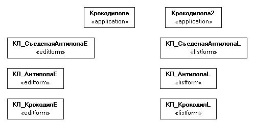
in the generated Assembly DesktopCustomizer will be a few classes to adjust.
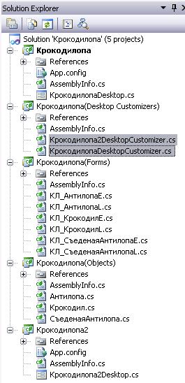
Note: DesktopCustomizers a separate Assembly for each application is generated.
Support Windows XP schemes
Controls Flexberry Platform support the scheme of user interfaces Windows XP:» «soft buttons, gradients on the tabs, etc., etc., Such support is included explicitly.
To a desktop application supported scheme UI Windows XP, you must:
- In the method
Main()application to invoke a methodICSSoft.STORMNET.Windows.Forms.WinApplication.EnableVisualStyles(); - Create
Manifestfile in the same directory where is. exe file, for example:
Application file — BugLeR.exe, the manifest file is BugLeR.exe.manifest, content:
<?xml version="1.0" encoding="UTF-8" standalone="yes"?>
<assembly xmlns="urn:schemas-microsoft-com:asm.v1" manifestVersion="1.0">
<assemblyIdentity
    version="1.0.0.0"
    processorArchitecture="X86"
    name="BugLeR"
    type="win32"
/>
<description>Your application description here.</description>
<dependency>
    <dependentAssembly>
        <assemblyIdentity
            type="win32"
            name="Microsoft.Windows.Common-Controls"
            version="6.0.0.0"
            processorArchitecture="X86"
            publicKeyToken="6595b64144ccf1df"
            language="*"
        />
    </dependentAssembly>
</dependency>
</assembly>