Main features
In our system, the main page changes depending on the privileges and access level of the user. This page quite often customized to suit a particular customer’s needs.
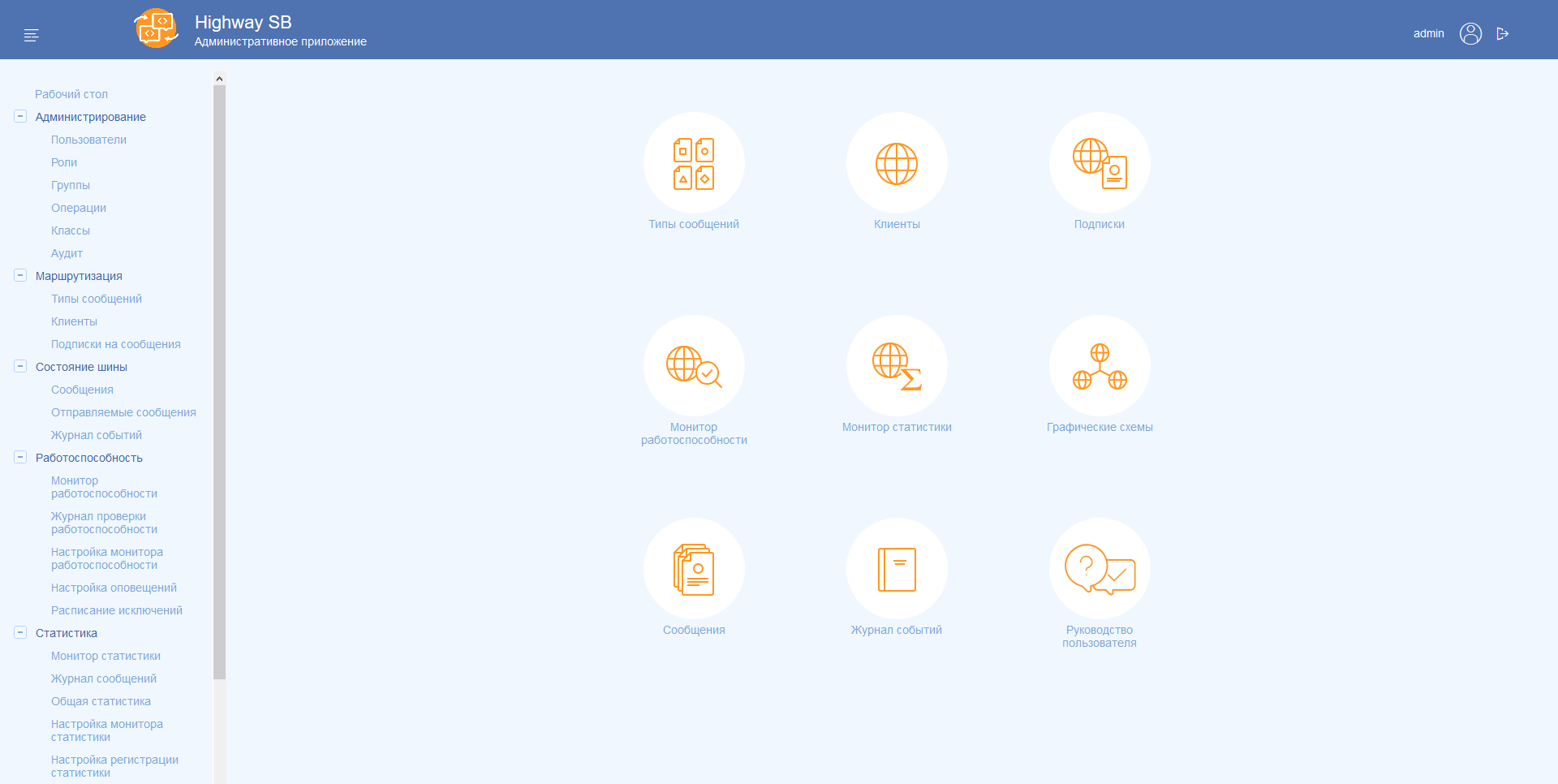
Basically a typical home page contains a set of card, icons, and small entry fields.
Main components main page: Home page
UIS MV:

Highway SB:

The prototype PROCEEDS:

When designing the home page you need to work through the following steps:
- Identify frequently used функции;
- To distribute what functions you want to assign to a specific ролей;
- To establish a hierarchy of these functions on the main page.
- To define additional elements.
The recommended location of the main elements
As an example, we divide into several groups the elements of the prototype:

1. The input field
Can perform several different functions:
- Search записям;
- Search selected разделу;
- Select the desired menu item (similar to Spotlight in macOS).
Correctly inserted the input field will greatly help the experienced user of the system and reduce the time for searching for the required section or entry.
2. Informer
Widgets need to display quick statistics on the system. Essentially a widget is a mini the dashboard with basic statistics. Possible any widget needs to redirect to the desired section. For example, click on the statistics new applications navigate to the appropriate section.
3. Card
Flashcards are a quick links to sections of the system. Cards can contain a title, an icon and links to subsections.