Components of data-entry forms
A typical form contains the following five components:
- Structure. Includes the order of the fields, the appearance of forms on the page and the logical relationships between multiple fields.
- The input field. Includes text fields, password fields, checkboxes, radio buttons and any other fields intended to input.
- The label lines. Usually explain to the user that indicates the input field.
- Button actions. Produce a specific action (e.g. submit form) (item Button).
- Feedback. We need to understand that the action is in progress or has completed. The result of the action may be positive (successful upload) or negative (error) (see section the Dialogue system).
Forms can also contain the following components:
- Hints. An explanation of how to fill out a form (section the Dialogue system).
- The validation. Data validation ensures that data entered is correct.
The structure of the form
Form is a way of communication with the user. Like any other conversation, it should consist of a logical connection between the two parties: the user and the application.
The logical sequence of the form
Build logic so that it was understandable from the user’s point of view.
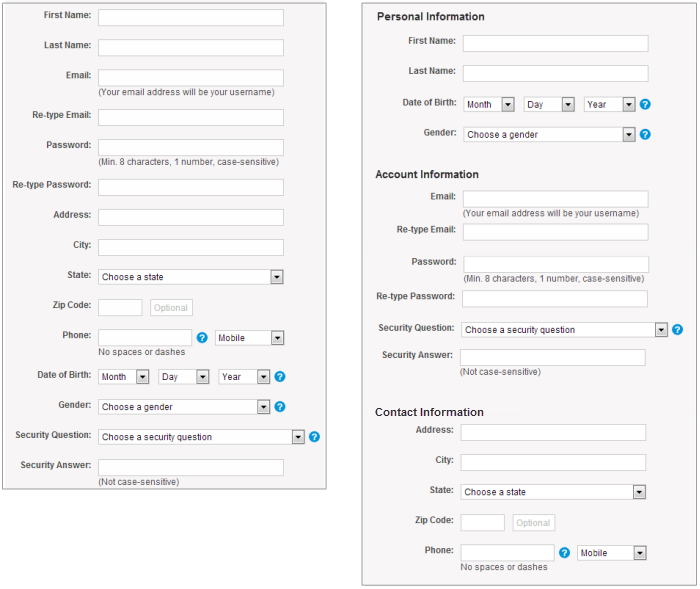
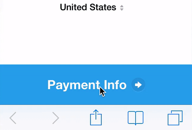
Grouping related information
Group related information into separate units and sets. Grouping of related fields will help users to understand the information they must provide. Let’s see how it works in the example forms of contact information below.
(Image: Nielsen Norman Group)
One column vs. Multiple columns
One of the problems with the organization of the form fields in multiple columns is inconsistent interpretation by users of these fields. If the form has a horizontal field, then the user must follow a Z-shaped trajectory along the shape, which slows down the speed of perception and makes the way to the end in a jumble. But if the form is made in one column, then the path to the completion of one down the page.
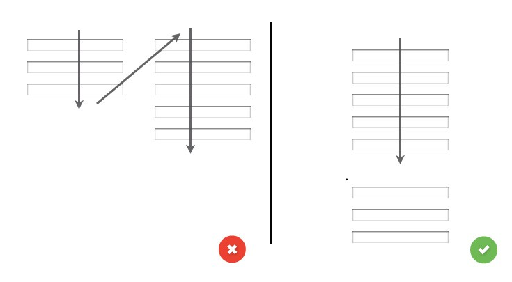
On the left you see one of the possible ways of interpretation of the forms is compiled into several columns. And opposed to the method of constructing forms in one column.

Input fields
Input field is a form element that allows users to fill it out. There are different types of fields for the information you need: text boxes, password fields, drop-down lists, check boxes, radio buttons, collectors information etc.
The number of fields
A key rule in the design of the form States that the shorter is the better. Thus, your task is to minimize the number of fields as possible. This will make your shape less loaded, especially when you ask to enter a lot of information. However, do not overdo it, because nobody likes the shape of the three fields, which are supplemented by 30 questions. At the moment the norm is 5-7 display fields.
Mandatory vs. Optional
Try to avoid optional fields in forms. If you do use them, then at least clearly distinguish the fields that can be empty.
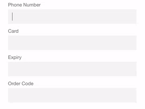
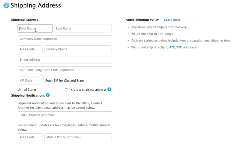
Input mask information
The mask information input is visual improvement that helps to format the entered information automatically. They appear when the user focuses on a specific input field, and this formatting helps the user focus on relevant information and easier to notice possible errors. In the example below, parentheses, spaces and dashes are automatically applied when entering telephone credit card numbers and other data with numbers. This method saves time and helps avoid mistakes when entering numeric values.
Desktop-Only: friends the form with the keyboard
Users should be able to focus on form and edit each box using only the keyboard. Experienced users who heavily use the keyboard, should be able to easily move between fields and edit them without lifting your fingers from the keyboard. You can find detailed requirements for interacting with the keyboard in W3C recommendation.

Desktop-Only: Autofocus on input field
Auto-select field gives the user an idea of where to start to quickly and correctly fill in the form fields. This technique provides a visual signal about any change, be it changing colors, fading in the window, flashing arrows, or other visual response. When creating the form, the analyst must consider the first field to focus and to be included in the formulation.
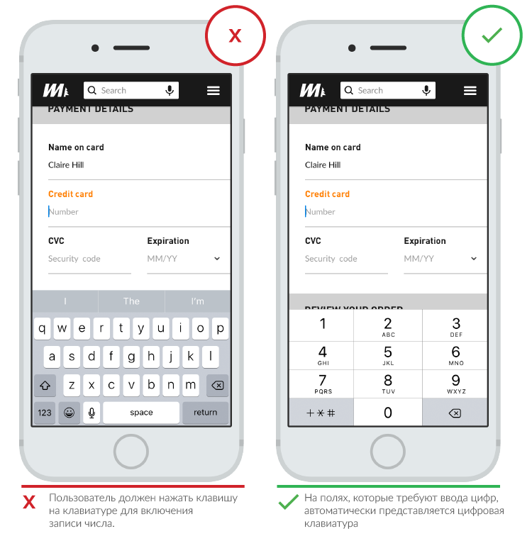
Mobile-Only: the Adaptive keyboard on request
When designing interfaces for smartphones always need to activate the appropriate keyboard for all input fields. If you want to enter a date, called date-picker, if it is a number, numeric keyboard etc.
The code below adds a field to enter a numeric keyboard on both Android and iOS. Detailed information can be found here: Android, iOS, StackOverflow.
<input type="number" pattern="[0-9]*" inputmode="numeric">
(Image: Google)
Autocomplete
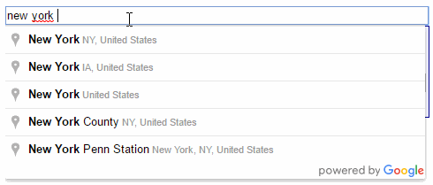
Autocomplete will help you to prevent typos and will improve user experience. This also applies to keyboard input. For example, the billing address is the most problematic part of any registration form. Tools such as AutoFill addresses (which uses geolocation, to provide an accurate determination of the location of the user) allows you to specify your address with fewer keystrokes than a normal input field.
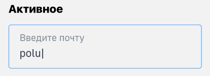
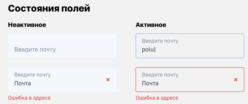
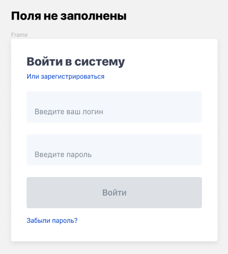
Label
Clearly written labels are one of the main ways to make the interface more accessible. The correct labels to inform the user about the purpose of the input fields retain their usefulness when the focus is on the field and remain visible even after all fields have been filled. Labels in our DS are located right within the input field or directly above it.

The number of words in the labels
Labels cannot replace text. You need to use succinct, short and clear labels (a word or two), to allow users to quickly read the form.
Capital letters at the beginning of vs. Capital Letters at the Beginning of Words
Most digital products today, there are two ways to use uppercase letters:
- At the beginning of words: capitalization of each word except prepositions and particles — «Is a Capital Letter».
- In the beginning of a sentence: capitalization of the first word in a sentence — «Is a capital letter».
The second option is used for the labels and has one advantage over the first: it’s a little easier to read. If the difference for short inscriptions is negligible, then for long it is already significant. Now You Know How Difficult it is to Read Long Text in Capital Letters.

Built-in tips (sometimes replaced label)
The set of hints as a placeholder in the input field disappear once the user focuses on this field. A good solution to the problem is built-in tips is a floating label. Built-in tooltip will be displayed by default, but as soon as the input field is activated, the built-in tooltip disappears.


Action buttons
Pressing the button causes some action, e.g. submitting a form.

The primary action vs. Secondary actions
The lack of visual distinction between primary and secondary actions can easily lead to problems. Increasing visual expressiveness of secondary actions minimizes the risk of errors and enhances the sense of movement to a successful result.
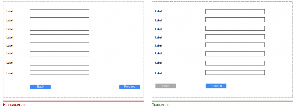
The location of the button
Complex forms, usually have a button» «Ago. If this button is located directly below the input field (as in the first screenshot below), the user may accidentally click on it. The thing is that the button» «Ago — this is a secondary action that should be less accessible (the second screenshot shows the correct location of the secondary buttons).
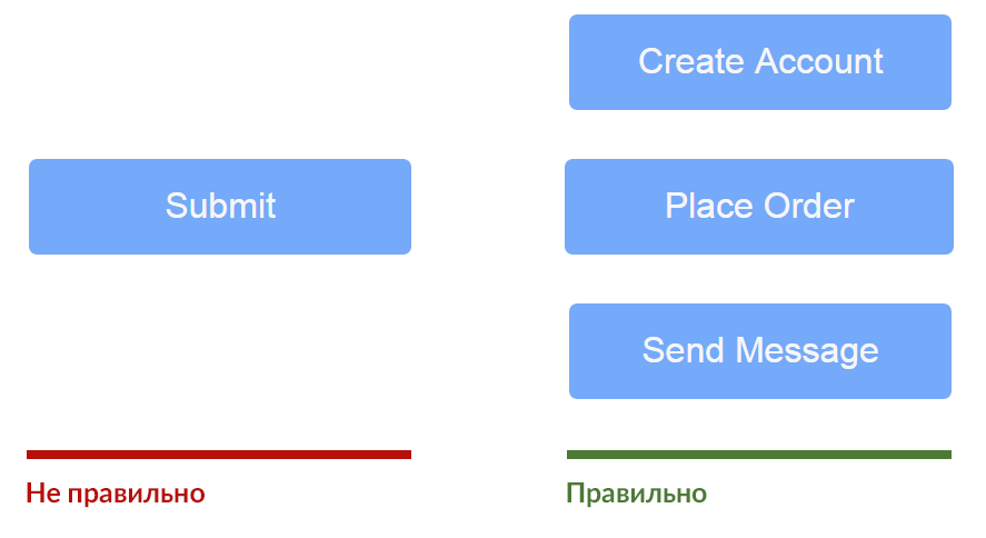
Rule names
Avoid General words, such as Send for actions, because they create the impression that the form is a template. Instead, specify the action that will be performed when the button is pressed, for example, Create my account or subscribe to weekly deals.
Buttons with multiple actions
Avoid buttons with multiple actions, as they may distract users from completing the form.
Appearance
Make sure buttons look like buttons: make the display press if you can.
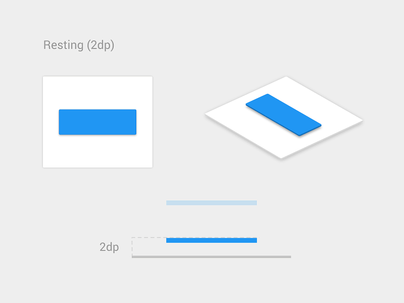
(Image: Material Design Guidelines) The shadow under the button indicates that it can be pressed.
Microsatellite
Design button Send so that it clearly showed that the form is processed after a user action. This provides feedback to the user and prevents double-clicking.
(Image: Michaël Villar)
Check
Validation errors of form are inevitable and are a natural part of input data (because users tend to make mistakes). Yes, errors should be minimized, but they will never be completely eliminated. So the most important question is how to make the test easy for the user so they can correct the mistakes?
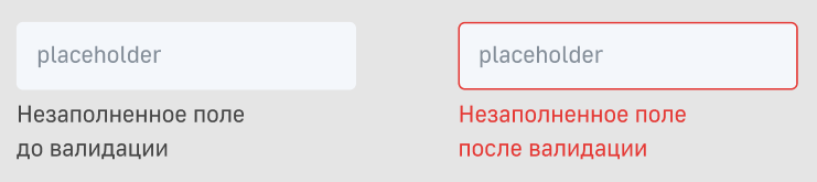
Built-in validation
Users don’t like that you have to complete the entire form and at the very end to find out the error. Especially frustrating is completing a long form the fact that after clicking Send» qmo, you are awarded with several error messages. It’s even more annoying when you do not understand where he was admitted these errors.

(Image: Stack Exchange)
The audit should inform users about the correctness of the entered text as soon as they entered it. Integrated real-time immediately informs the user about the correctness of his data. This approach allows them to correct mistakes faster, instead of waiting until they click on the button to Send» qmo.
However, avoid validation on every keystroke, because in most cases, you just can’t be sure that the user has finished typing the answer. Sometimes the form needs to validate data at the time when the user navigates to a new field.
(Image: Medium) Google forms indicate that the email address that you enter is invalid, before you finish typing.
On the other hand, form validation after input data does not tell the user that he made a mistake with due diligence.
(Image: Medium) Check the Apple store is made after data entry.
Michael Cognevich, in his article «Test in the form of: interaction Design», considering various strategy of validation and proposes a hybrid strategy to satisfy both sides:
- Reward sooner, to punish поздно;
- If the user enters data in a field that was in a valid state (the data entered was valid), the validation is performed after entering данных;
- If the user enters data in a field that was in an invalid state (i.e., data previously entered was invalid), then a check is made during data entry.
(Image: Medium)