Component: fonts. Font Converter: Online Font Converter
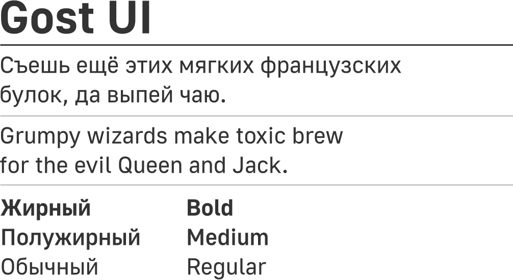
Gost UI
Primary font for use in systems.
General rules of use
The mark
Bold
The font style is determined by its function. In the design system we use for accent Bold section headers. It is necessary to draw attention to the title.
Medium
If you have a content header, for example, the title of the document, it is better to use a font Medium, which is used for interactive elements.
Regular
Regular used for typesetting text.
Size
The font size is selected from the available design system. Each style has its own name, explaining its use, for example:
Desktop / Paragraph / S 14pt – a small stacked text. The name is preserved in the transition from desktop version to mobile.
This allows you to set common rules for adaptation and the same text on the mobile version will be slightly less – Mobile / Paragraph / S 12pt.
Dimensions
Desktop
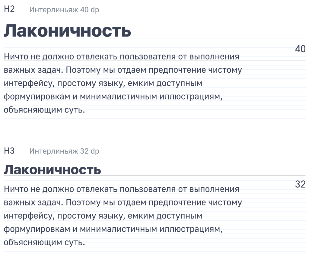
Headers
- H1 –
48pt,bold, leading56dp; - H2 –
32pt,bold, leading40dp; - H3 –
24pt,bold, leading32dp; - H4 –
18pt,bold, leading26dp.
Interactive elements
- XL –
32pt,medium, leading40dp; - L –
24pt,medium, leading32dp; - M –
18pt,medium, leading26dp; - S –
16pt,medium, leading24dp; - XS –
14pt,medium, leading20dp.
Typesetting text
- L –
24pt,regular, leading32dp; - M –
18pt,regular, leading26dp; - S –
16pt,regular, leading24dp; - XS –
14pt,regular, leading20dp.
Mobile version
Headers
- H1 –
24pt,bold, leading28dp; - H2 –
20pt,bold, leading26dp; - H3 –
18pt,bold, leading24dp; - H4 –
16pt,bold, leading22dp.
Interactive elements
- XL –
20pt,medium, leading26dp; - L –
18pt,medium, leading24dp; - M –
16pt,medium, leading22dp; - S –
14pt,medium, leading20dp; - XS –
12pt,medium, leading16dp.
Typesetting text
- L –
18pt,regular, leading24dp; - M –
16pt,regular, leading22dp; - S –
14pt,regular, leading20dp; - XS –
12pt,regular, leading16dp.
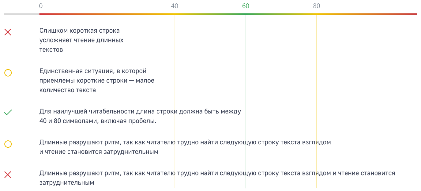
The length of the string
For the reader’s eye long or short strings tedious. Long to ruin the rhythm because the reader is difficult to find the next line of text. The only situation in which the acceptable short line – a small amount of text. For better readability the length of the string must be between 40 and 80 characters, including spaces.
The padding from the header
There is a simple rule to determine the optimum offset from the header to stacked text. The distance between baselines of the stacked text and the header is equal to the line spacing of the header.
The contrast with the background
The availability of color combinations can be checked using WAVE Evaluation Tool
Background: #FFFFFF
Font color: #3B4256

Background: #F4F7FB
Font color: #3B4256

Background: #000000
Font color: #F4F7FB

Background: #0C49CD
Font color: #F4F7FB