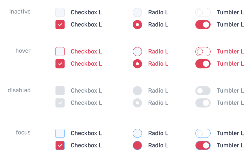
If you want to select from existing sets: Sets color
Main color
For each site may be a primary color. When choosing be aware that it will be used to: links, buttons, and fills large dice. The text is white on a name plate must remain readable. At the same time reference within the text should be clearly distinguishable. Should not have to try to find for each site is unique, no one used color. The color can be chosen close to the logo, or existing brand identity.
Example base color:
#E14059

Choice of accent color
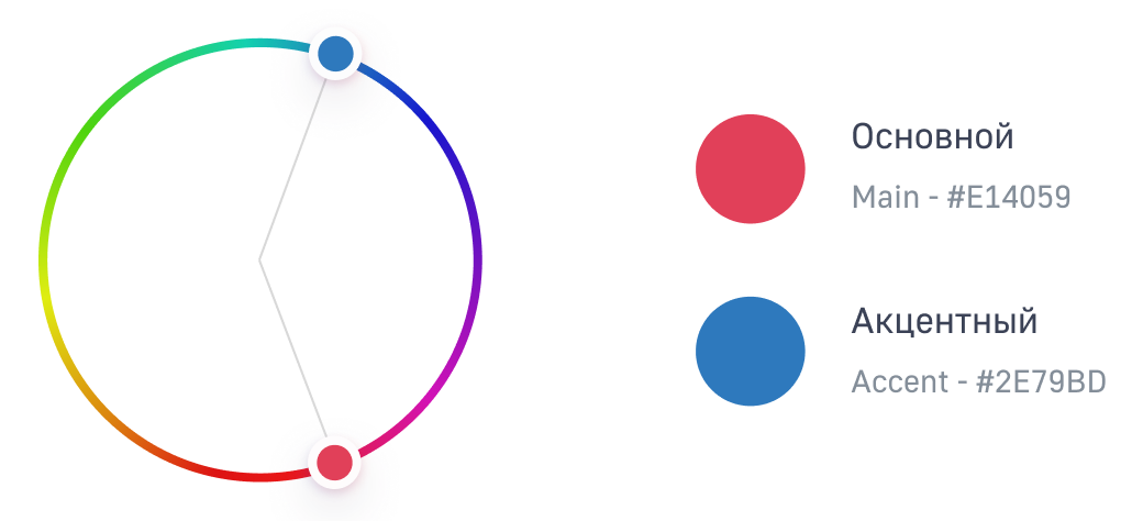
For sites with a large number of functions can be chosen as additional accent color. Because these sites a lot of complex UI elements and need to split primary and secondary actions. To select the accent color, you need to use a combination of two colors, located at a distance of from one quarter to one third of the colour circle.
Basis:
#E14059Accent:#2E79BD
When building models of new IP should use the following resources to identify the primary, secondary and accent colors and their compatibility:
Palx - Automatic UI Color Palette Generator
Background color
Most of the IP of the content area is white #FFFFFF. It helps to focus and reduces eye strain. Grey background divides the content into meaningful units and groups the elements on the page.
Customize palette
Sets the color palette of the following parameters remains constant for any IP:
- Colors элементов;
- Colors состояний;
- Рамки;
- Interactive and transparent elements.
Match the colors of the subject area
In this question it is first necessary to be guided by the brandbook of the company, and in its absence, find the matching color of the subject area.
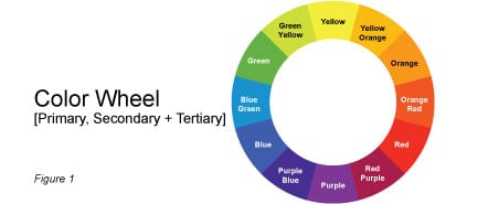
Most color schemes and the rules of combining colors based on the color wheel in color theory. In order to master the more complex rules of combining colors, it takes practice, but there are simple rules. If the IP is in harmony of color, people working in it, better recognize and understand the contained information. Color theory is not nuclear physics and higher mathematics, but this does not detract from its role in enhancing the effectiveness of the interface. Below are the basic tools for creating correct color schemes:
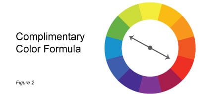
A complementary color
This scheme allows to determine the opposite color. Scheme of complementary colors according to the principle «opposites attract».
Analog color
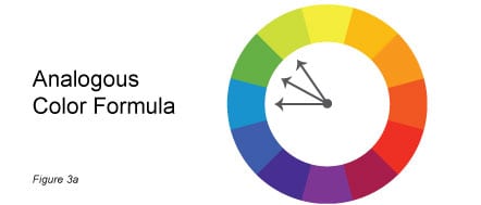
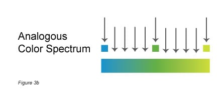
Analog color formula, which is used by many companies involves the combination in the palette of three colors that are close on the color wheel. For example, if the main color is green, will look perfectly combined with the colors that are on either side of it on the color wheel. To expand the palette can be achieved at the expense of those of the spectrum colors, which are on the circle between the three initial colors.
Process colors
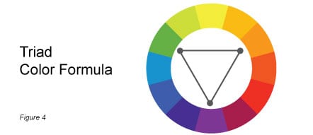
This is the most complex of all simple color formulas. To begin, select the first color, then the other two, so that the imaginary connecting lines between them on the color wheel formed an equilateral triangle. Process scheme is well balanced and harmonious.
An example of adaptation of flowers
Color
Main: #E14059
Second: #7699B3
Accent: #2E79BD

Button
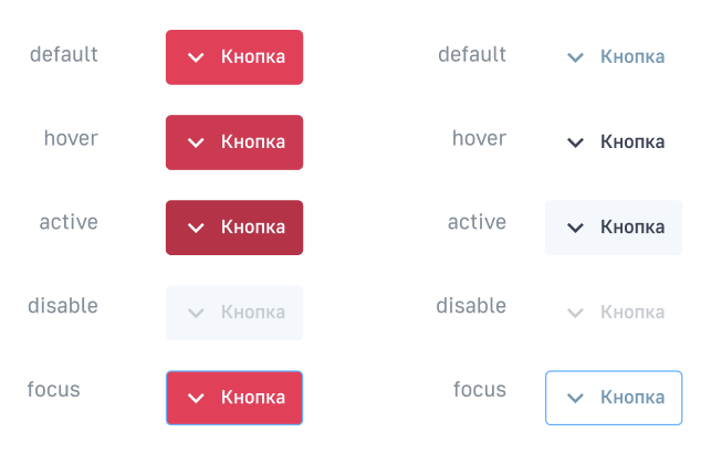
Change theme Primary, and Empty. All controls that contain a button with these themes automatically are branded.
Composite controls
Switch

Pagination

Toggler

Flexberry Menu

Checkboxes, radio buttons, toggle
