The concept of heuristics
Heuristics Jakob Nielsen is one of the most simple and effective ways to assess the quality and usability of user interface. In General, the term heuristics should understand some algorithm that does not have strict and formal submission, but extremely useful in practice.

There are 10 key principles of convenience (or usability) by Nielsen:
1. Displaying system status
Any user must understand that in each moment of time happens to his system, for example, if it is stuck or lost, the user in any case should not see error code, but should get a soft notice that something goes wrong, and it is also desirable to inform about what he should do.
It is also important to inform the user about what happened after committing any action. For example, if the user clicks save, you need to tell him that the save was successful, and all will be calm.
2. Match between system and the real world
Always considered that the user is not very smart, so don’t use difficult terms, if they cannot be avoided it is necessary to provide some explanations to the user interaction with the system to avoid any misunderstandings. The system needs to communicate with the user in human language, and not Vice versa.
3. Freedom of action and control
This paragraph implies that the user should be able to cancel an action (to move it back if something went wrong), and perform the action again. In addition, it is necessary to consider the possibility of an emergency exit from undesirable system States in the original.
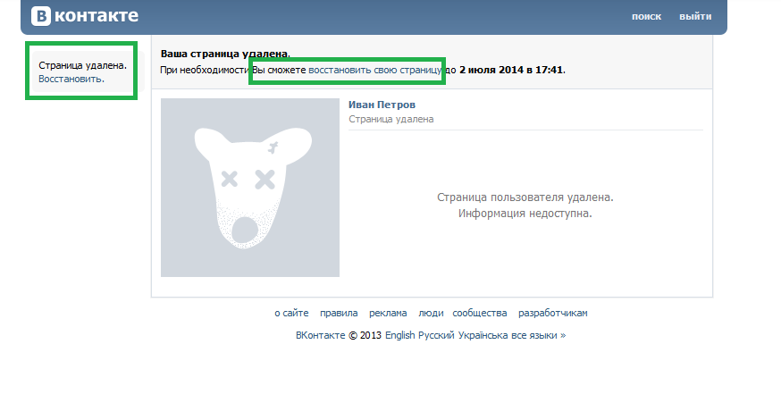
As example, the ability to delete your page or entry in a well-known social network, you can do so by clicking one button in the case of recording, or the performance of a simple algorithm in several steps. However, in the same place there is a notification with an offer to restore just the deleted item and the user can easily return that if he changed his mind or made a mistake.
4. Uniformity and standards
The user, once being able to understand the logic of the system needs to be sure that it works everywhere. It is necessary to keep to the uniformity and follow standards.
For example, if the user realizes that he has a set of functions to work with just one list form, the same set must be present on all list forms. Or, if the search string is located in the upper right corner, it should be present everywhere at the same place, so without looking you can have it “poke”.
5. Prevention of errors
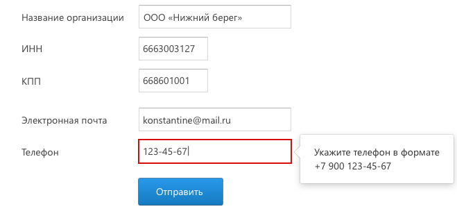
Main rule this clause is error need not to tell, and to try to prevent them. For this you need to consider even the most ridiculous situation in which the user can potentially make a mistake. For example, when filling out any form can be placed clues that indicate the format of the input data. And required fields should be marked, especially if a lot of fields is optional.
6. Recognition beyond memories
This point echoes the previous one, as in the example about the uniform position of the seek bar on any page. The user does not have to remember where everything is. Everything must be either in sight, or intuitive, although, as we know, intuition all developed differently.
7. Flexibility and efficiency of use
Flexibility implies the possibility to achieve the same result in different ways. It is important to have an expert user to use hot keys, like “Esc” to cancel the action or close the window or press “Enter” to confirm input.
One of the possible scenarios – closes the dialog can happen in different ways:
- By pressing “OK” in the dialog box.
- By pressing “Esc” on the keyboard.
- By clicking the x in the corner of the dialog box.
- Click in any point outside of the dialog box.
This format with multiple points of entry and exit allows the design to be efficient and nonlinear.
8. Aesthetics and minimalism
Of course, every designer and the user understand the minimalism and perceive the beauty in different ways. However, there are more or less universal set of rules that best be followed. So, one of the basic rules – the reduction of the input fields on the form. If we, as the creators of the system can without something to do or can otherwise obtain any information, it is better to remove extra input fields from the form. It can be called an effort to reduce redundancy.
9. Aid users in the recognition and correction of errors
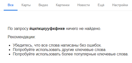
Nothing in the world perfect doesn’t exist, so any system errors can occur. It is important not only to be able to handle them, but also to correctly notify the user. Us if the error still persists, the user should not see a blank page or a code exception.
For example, when a failure or incorrect search, the user must understand that did something wrong. And also get recommendations to remedy the situation.
10. Help and documentation
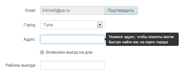
Even if we think that the system is easy to use without documentation, users don’t think so. It is important that in all places where there may be misunderstandings pop up explanations. As, for example, forms to fill, you can not only specify the format of the input data, but also to tell why this field is important (if not obvious).
It is also great to have a separate section on the website with common questions and their solutions.
A small epilogue
Of course, these heuristics can not be the solution to all problems when creating the user interface, however, they are generally accepted. Therefore, when designing your design, you should at least make sure that none of the items were not grossly violated, then the future of the system is much more likely to be well accepted and understood by the end user.