Description
Component flexberry-file provides several features:
- The option for user to any file on the client устройстве;
- Ability to upload that file on сервер;
- The ability to download previously uploaded file from the server with a subsequent saving on the client устройстве;
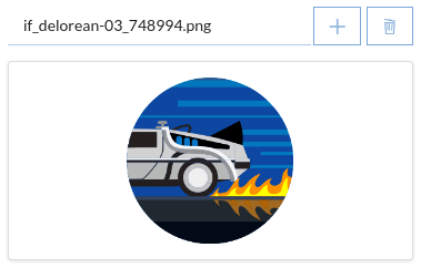
- Image files are also available предпросмотра;
General view of the component, if the current theme “BlueSky”:

The component is implemented under the tools for working with the files available to the OData service (as you can read in the article “working with files using the OData-service”).
Further, we assume that the means of working with files in the OData service is already configured, and the file controller are available at <Address of the host where the deployed OData service>/api/File.
The list of properties
| Property name | Brief description |
|---|---|
uploadUrl |
Address to upload files to server |
maxUploadFileSize |
vozmozhnoy Maximum file upload size |
showPreview |
a Flag that indicates whether to show the block preview |
showUploadButton |
Flag indicating whether to display a separate button to load file on server |
showDownloadButton |
Flag indicating whether to display a separate button to download the file from the server |
showModalDialogOnUploadError |
a Flag that indicates whether to show modelini dialog on error: file |
showModalDialogOnDownloadError |
a Flag that indicates whether to show modelini dialogue when there is an error loading file |
openFileInNewWindowInsteadOfloading |
Flag indicating whether to attivati file in a new browser tab, after downloading |
previewSettings |
Settings display a modal window preview images |
Address setup to upload files to the server
To component flexberry-file could upload files to the server, he should at least know the URL for downloading under this URL in the component provided by the property uploadUrl, which must be specified address of the file controller.
Property uploadUrl can be configured in two ways:
- Either directly in
hbs-template:{{flexberry-file uploadUrl="<The address of the node on which the deployed OData service>/api/File" }} - Either in the application’s configuration file
config/environment.js(not to specify it every time we use the component):{ ... APP: { ... components: { flexberryFile: { uploadUrl: '<Адрес узла, на котором развернут OData-сервис>/api/File' } } ... } ... }
File property in ember-models and component binding to it
When we request OData service data object, containing any file type property as the value of this property OData service always sends not the file itself (since proofreading of the data objects together with the files that would have lasted very long), and only the serialized meta description of the file, which has the following form:
{
  // URL for downloading the file.
  "fileUrl":"<The address of the node on which the deployed OData service>/api/File?...",

  // URL for download of a preview (if the file is an image).
  "previewUrl":"<The address of the node on which the deployed OData service>/api/File?...&getPreview=true",

  // The file name.
  "fileName":"image.png",

  // File size in bytes.
  "fileSize": 12345,

  // The MIME type of the file.
  "fileMimeType": "image/png"
}
Because the meta description comes serialized, i.e. a string, then from the point of view ember-and it is absolutely no different from any other string type properties string, but in the addon ember-flexberry-data it has made a special transformation file to file properties can be distinguished from the others (thus, for example, a component flexberyy-groupedit understands that to work with a property of this type need to embed the component flexberry-file, not just flexberry-textbox).
Therefore, in ember-models file properties are described as follows:
export default BaseModel.extend({
  myFileProperty: DS.attr('file')
});
Component flexberry-file accepts this meta description as a property value value, i.e. if the meta-description file is located in the model property myFileProperty, the binding will look as follows:
{{flexberry-file
  relatedModel=model
  value=model.myFileProperty
}}
Property relatedModel it is also necessary to specify it must refer to a model that contains a property file, so that when you save the model component flexberry-file could first upload the user selected file (if available).
Appearance settings
Component flexberry-file contains several settings allow you to customize its appearance:
showUploadButton- flag indicating whether to display a separate button to load the file to the server or not (defaults to the valuefalsebecause the file download occurs when you save a model from propertiesrelatedModeland the need for a separate button - no).
Appearance included with the download button:

showDownloadButton- flag indicating whether to display a separate button to download the file from the server or not (defaulttrue).
Appearance off click download:

readonly- a flag that indicates whether the component is in read-only mode (defaults to valuefalse). In this mode, hidden buttons, file selection, file deletion, file upload to the server, and there is no possibility to change or delete a file, there is only the possibility to download it.
Appearance in read-only mode:

showPreview- flag indicating whether to display a block of thumbnails (defaults to the valuefalse, the setting is relevant for image files, in the case of other file types block preview will be empty).
Appearance with the included block preview:

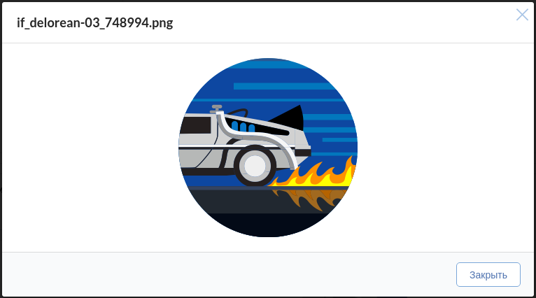
If you press the block predprostora opens a modal dialog where the selected image file is displayed in its actual size without compression:

For the opening of the dialogue corresponds action flexberryFileViewImageAction that is already implemented in the basic controller forms editing, but if some reason want to override, or to perform some other action by clicking on the unit preview, you can set your action via the component property viewImageAction:
   {{flexberry-file
     ...
     showPreview=true
     viewImageAction="flexberryFileViewImageAction"
   }}
previewSettings- display a modal window preview image (default {}, customizes the display of a modal window predprosmotr downloaded files).
  /**
 Settings for preview modal dialog.

 @property previewSettings
 @type Object
 */
  previewSettings: {
    detachable: true,
    context: 'body',
  },
  {{flexberry-file
    ...
    showPreview=true
    viewImageAction="flexberryFileViewImageAction"
    previewSettings=previewSettings
  }}
If you press the block predprostora opens a modal dialog, which is tied to the body.
Working with files in the base64 format
Component flexberry-file has the ability to work with files in the base64 format.
For this you need to set some component parameters:
  {{flexberry-file
    ...
    base64Value=base64String
    base64FileName="test"
    base64FileExtension="jpg"
  }}
base64Value parameter, which should contain a string in base64 format. When you change the value base64Value and successfully processed in the file control variable is assigned the value null. It is related to specific file and control is necessary for situations when the user wants to attach/replace file selected from the file system after using base64Value.
base64FileName and base64FileExtension attributes to the name and uploads the file.
The name will look like :
`{base64FileName}.{base64FileExtension}`
To display a modal window error when handling base64 encoded files, you must set the parameter value showModalDialogOnUploadError true.
Appearance settings in the mobile view
Component flexberry-file has a special view for mobile devices.
In this view the component in which the user has not selected a file that looks like a button that says “Add file” (this inscription can be customised by setting it through the property addButtonText component):

When the user has selected a file, the component looks like a button with drop-down menus, and items to replace the file, downloading it, downloading and if the file is an image, enlarge:
