Components to display text fields
flexberry-field
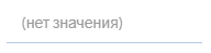
flexberry-field - the component to display text fields with labels. General view of the component, if the current theme “BlueSky”:

To add flexberry-field to the page template you need to specify:
{{flexberry-field
  value=model.text
  label=label
  placeholder=placeholder
  readonly=readonly
  type=type
  maxlength=maxlength
}}
Properties flexberry-field
| Property | Brief description |
|---|---|
Properties componentName and readonly |
Properties from the basic control. |
value |
Defines the value that will be displayed. |
placeholder |
Single placeholder. |
label |
Specifies the label. |
classNames |
Defines css class to the component. |
type |
Determines the type of the component. |
maxlength |
Specifies the maximum number of characters (code units UTF-16), which can be entered by the user. |
appConfigSettingsPath |
Specifies the path to the component settings in the application configuration. |
flexberry-textbox
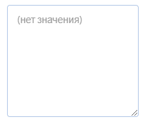
flexberry-textbox component to display text fields in a single string. General view of the component, if the current theme “BlueSky”:
To add flexberry-textbox on the page, in the template you need to specify:
{{flexberry-textbox
  value=model.text
  placeholder=placeholder
  readonly=readonly
  class=class
  maxlength=maxlength
}}
Properties flexberry-textbox
| Property | Brief description |
|---|---|
Properties componentName and readonly |
Properties from the basic control. |
value |
Defines the value that will be displayed. |
placeholder |
Single placeholder. |
classNames |
Defines css class to the component. |
type |
Determines the type of the component. |
maxlength |
Specifies the maximum number of characters (code units UTF-16), which can be entered by the user. |
appConfigSettingsPath |
Specifies the path to the component settings in the application configuration. |
flexberry-textarea
flexberry-textarea component to display text fields in the form area into which you can enter multiple lines. General view of the component, if the current theme “BlueSky”:
To add flexberry-textarea to the page, in the template you need to specify:
{{flexberry-textarea
  value=model.text
  placeholder=placeholder
  readonly=readonly
  class=class
  rows=rows
  cols=cols
  maxlength=maxlength
}}
Properties flexberry-textarea
| Property | Brief description |
|---|---|
Properties componentName and readonly |
Properties from the basic control. |
value |
Defines the value that will be displayed. |
placeholder |
Single placeholder. |
classNames |
Defines css class to the component. |
appConfigSettingsPath |
Specifies the path to the component settings in the application configuration. |
rows |
Defines the number of rows in the table associated with the text area. |
cols |
Defines the number of columns in the table associated with the text area. |
Components to display the date
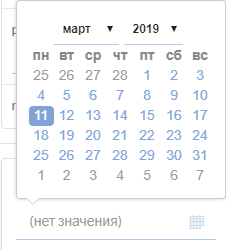
flexberry-datepicker
flexberry-datepicker - component to display the date.
To add flexberry-datepicker on the page, in the template you need to specify:
{{flexberry-datepicker
  dateTimeFormat=dateTimeFormat
  hasTimePicker=hasTimePicker
  minDate=minDate
  maxDate=maxDate
  value=model.date
  placeholder=placeholder
  readonly=readonly
  drops='up'
}}
Properties flexberry-datepicker
| Property | Brief description |
|---|---|
Properties componentName and readonly |
Properties from the basic control. |
value |
Defines the value that will be displayed. |
placeholder |
Single placeholder. |
classNames |
Defines css class to the component. |
hasTimePicker |
a Flag that determines whether to display the time in both the control and the time cursor inside the date function. |
dateTimeFormat |
Defines the date format. |
minDate |
Determines the earliest date that a user can choose. |
maxDate |
Determines the last date that the user can choose. |
drops |
Defines the calendar appears below (qmc «down by default) or higher (up» qmo) of the element to which it is attached. |
type |
Determines the type of the component. |
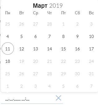
flexberry-simpledatetime
flexberry-simpledatetime component to display the date/date and time.
To add flexberry-textarea to the page, in the template you need to specify:
{{flexberry-simpledatetime
  type=type
  removeButton=removeButton
  value=model.date
  min=min
  max=max
  readonly=readonly
}}
Properties flexberry-simpledatetime
| Property | Brief description |
|---|---|
Properties componentName and readonly |
Properties from the basic control. |
value |
Defines the value that will be displayed. |
placeholder |
Single placeholder. |
classNames |
Defines css class to the component. |
defaultMinute |
Defines the value of the minutes by default. |
defaultHour |
Defines the hour digits by default. |
useBrowserInput |
a Flag that determines whether to use a PSU imput browser |
min |
Determines the earliest date that a user can choose. |
max |
Determines the last date that the user can choose. |
type |
Determines the type of the component. |
canClick |
a Flag that determines whether the onClick to call flatpickr.open() |
removeButton |
a Flag that determines whether to display the delete button at flatpickr |
locale |
Single locale (If not specified, uses the locale of the application). |
Components to display Boolean fields
flexberry-checkbox
flexberry-checkbox component to display Boolean data.

Flexberry to add a checkbox to the page in the template, you need to specify:
{{flexberry-checkbox
  value=model.flag
  label=label
  readonly=readonly
  class=class
}}
Properties flexberry-checkbox
| Property | Brief description |
|---|---|
Properties componentName and readonly |
Properties from the basic control. |
value |
Defines the value that will be displayed. |
classNames |
Defines css class to the component. |
label |
Specifies the label. |
flexberry-ddau-checkbox
flexberry-ddau-checkbox component to display Boolean data.

To add flexberry-ddau-checkbox on the page template you need to specify:
{{flexberry-ddau-checkbox
  class=class
  value=model.flag
  caption=caption
  readonly=readonly
  change=(action "onCheckboxChange" "model.flag")
}}
Properties flexberry-ddau-checkbox
| Property | Brief description |
|---|---|
readonly |
Determines if the object is read-only. By default, this property is set to false. |
value |
Defines the value that will be displayed. |
classNames |
Defines css class to the component. |
caption |
Defines the component header. |
Components to display enumeration
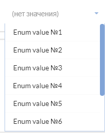
flexberry-dropdown
flexberry-dropdown - component that displays the listing.
To add flexberry-dropdown on the page, in the template you need to specify:
{{flexberry-dropdown
  items=(flexberry-enum "components-examples/flexberry-dropdown/settings-example/enumeration")
  value=model.enumeration
  placeholder=placeholder
  readonly=readonly
  class=class
}}
Properties flexberry-dropdown
| Property | Brief description |
|---|---|
Properties componentName and readonly |
Properties from the basic control. |
value |
Defines the value that will be displayed. |
class |
Defines css class to the component. |
items |
Defines an enumeration. |
placeholder |
Single placeholder. |
appConfigSettingsPath |
Specifies the path to the component settings in the application configuration. |
isSearch |
Mode autocomplete in the dropdown. |
Components to display JSON
flexberry-jsonarea
flexberry-jsonarea component to display JSON.
To add flexberry-jsonarea to the page in the template, you need to specify:
{{flexberry-jsonarea
  value=model.json
  placeholder=placeholder
  readonly=readonly
  classNames=classNames
}}
Properties flexberry-jsonarea
| Property | Brief description |
|---|---|
readonly |
Determines if the object is read-only. By default, this property is set to false. |
value |
Defines the value that will be displayed. |
classNames |
Defines css class to the component. |
placeholder |
Single placeholder. |
Components to control the shape:
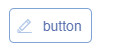
flexberry-button
flexberry-button component to create a web page button.
To add flexberry-button on the page, in the template you need to specify:
{{flexberry-button
  class=class
  iconClass=class
  caption=caption
  tooltip=tooltip
  readonly=readonly
  click=(action "onButtonClick")
}}
Properties flexberry-button
| Property | Brief description |
|---|---|
readonly |
Determines if the object is read-only. By default, this property is set to false. |
classNames |
Defines css class to the component. |
caption |
Defines the component header. |
tooltip |
Defines the tooltip text of the component. |
iconClass |
Defines css class for the icon component. |
flexberry-ddau-slider
flexberry-ddau-slider - component to create a web page slider.

To add flexberry-ddau-slider on the page, in the template you need to specify:
{{flexberry-ddau-slider
  classNames=classNames
  value=model.opacity
  min=min
  max=max
  defaultValue=defaultValue
  step=step
  readonly=readonly
  change=(action "onOpacitySliderChange")
}}
Properties flexberry-ddau-slider
| Property | Brief description |
|---|---|
readonly |
Determines if the object is read-only. By default, this property is set to false. |
classNames |
Defines css class to the component. |
value |
Defines the value that will be displayed. |
min |
Determines the minimum value of the component. |
max |
Determines the maximum value of the component. |
step |
Defines the pitch range of the component. |
defaultValue |
Determines the initial value of the component. |
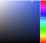
flexberry-colorpicker
flexberry-colorpicker - component for selecting colors for a web page.
To add flexberry-colorpicker on the page, in the template you need to specify:
{{flexberry-colorpicker
  value=value
  class=class
  change=(action "onGradientColorEndChange")
}}
Properties flexberry-colorpicker
| Property | Brief description |
|---|---|
classNames |
Defines css class to the component. |
value |
Defines the value that will be displayed. |