Purpose of the component
A LookUp is a control (component) that allows you to select the wizard. General view of the component, if the current theme “BlueSky”:
To add a component to the ember app, you need to verify the correctness of the configuration models, the serializer and the template.
Let the entity Подготовка is the master Редактор type Пользователь. You want to configure the LookUp by property ExtendedName master.
Customize your model
Model Подготовка should contain a reference to the master. View to display the form where it will be located LookUp should also include a description of the wizard.
var Model = BaseModel.extend({
  редактор: DS.belongsTo('пользователь', { inverse: null, async: false })
});

Model.defineProjection('ПодготовкаE', 'подготовка', {
  редактор: Proj.belongsTo('пользователь', 'Редактор', {
      extendedName: Proj.attr()
  })
});
In the models corresponding to the master type Пользователь, you must specify a view under which you will be displaying.
var Model = BaseModel.extend({
  extendedName: DS.attr('string')
});

Model.defineProjection('ПользовательE', 'пользователь', {
  extendedName: Proj.attr('Полное имя')
});
Configure serializers
In serializer Подготовка to describe the link to the wizard:
export default ApplicationSerializer.extend({
  attrs: {
      редактор: { serialize: 'odata-id', deserialize: 'records' }
  },
  primaryKey: '__PrimaryKey'
});
Serializer for the type Пользователь:
export default ApplicationSerializer.extend({
  attrs: {  },
  primaryKey: '__PrimaryKey'
});
Customize template
On the edit page class Подготовка insert design:
<div class="field">
  <label>Редактор</label>
  {{#if model.errors.редактор }}
    <span style="color:red">{{model.errors.редактор }}</span>
  {{/if}}
  {{flexberry-lookup
    componentName="lookupUsers"
    choose=(action "showLookupDialog")
    remove(action "removeLookupValue")
    updateLookupValue=(action "updateLookupValue")
    value=model.редактор
    relatedModel=model
    relationName="редактор"
    projection="ПользовательE"
  }}
</div>
Overview of features and component API
List of basic properties
| Property | Description | Default value |
|---|---|---|
choose |
Specifies the name of the action and that will be happening by clicking on the button ‘choose’. | |
remove |
Specifies the name of the action and that will be happening by clicking on the button ‘remove’. | |
updateLookupValue |
Specifies the name of the action and that will be happening when lookup value is changed. | |
chooseText |
Defines the text/html inside the button ‘choose’. | |
removeText |
Defines the text/html inside the button ‘remove’. | |
chooseButtonClass |
Defines css class for button ‘choose’. | |
removeButtonClass |
Defines css class for button ‘remove’. | |
placeholder |
Defines placeholder | t(‘flexberry-lookup.placeholder’) |
value |
Determines the selected model instance (master object) | |
relatedModel |
Specifies the model for which will be edited the reference to a master object) | |
relationName |
Specifies the name of the relationship | |
projection |
Determines which view will be displayed in the wizard list | |
sizeClass |
Defines css class of the window size options are: small, large, fullscreen | small |
title |
Header modal window | |
lookupLimitPredicate |
Defines function restriction | |
lookupAdditionalLimitFunction |
Additional function ogranicenje for use in GroupEdit relative to the margin line | |
autocomplete |
Mode autocomplete, in the “read-Only” doesn’t work | false |
dropdown |
Mode drop-down list in the “read-Only” doesn’t work | false |
dropdownIsSearch |
search Mode (autocomplete) for a LookUp-and in the mode drop-down list | false |
displayAttributeName |
the name of the model attribute (properties master), which is displayed to the user | |
sorting |
Direction to sort by the field ‘displayAttributeName’ mode autocomplete and in the mode drop-down list | ‘asc’ |
minCharacters |
Minimum number of characters to autocomplete mode autocomplete and in the mode drop-down list | 1 |
maxResults |
Maximum number of records displayed in autocomplete mode and in the mode in the mode drop-down list, not required property | 10 |
Possibility to override the behavior when the value of the lookup changes.
If additional logic is needed when changing the value of the lookup, it is necessary to override the updateLookupValue action in the controller of the form on which the lookup is located:
  actions: {
    updateLookupValue() {
      // Base logic
      this._super(...arguments);

      // Additional logic
      // ...
    }
  }
Button display the selected value (preview)
To use this feature, a LookUp is required to determine the following properties:
{{flexberry-lookup
  preview=(action "previewLookupValue")
  showPreviewButton=true
  previewFormRoute=previewFormRoute
  // ...
}}
Below are attached to LookUp properties for the operation of the preview button:
| Property | Description | Default value |
|---|---|---|
preview |
Specifies the name of the action and that will be happening by clicking on ‘preview’ button. | |
showPreviewButton |
a Flag that determines whether to display the browse button. | false |
previewFormRoute |
Defines a Route that will open the currently selected value. | |
previewOnSeparateRoute |
a Flag that determines whether to open the selected value in a separate page (opens by default in a modal window) | false |
previewButtonClass |
Defines css class on the ‘preview’ button. | |
previewText |
Defines the text/html inside the button ‘preview’. | |
controllerForPreview |
Controller Determines, for the selected value (if not specified controller is taken from “previewFormRoute”). |
Custom settings for the list in a LookUp-e (componentName)
For the list in a LookUp-e you can use the user settings from the service user settings.
They are specified in the property componentName when specifying the template.
{{flexberry-lookup
  componentName="lookUpClassLookup"
  // ...
}}
The block form of the component
It is possible to use a component in block form:
{{#flexberry-lookup ...}}
  {{model.employee1.firstName}}<br>
  {{model.employee1.lastName}}
{{/flexberry-lookup}}
in this case, the application programmer can override how it will look in the display wizard on the form
Customizing the List of Values Window
Setting the modal window LookUp-as defined in components/lookup-field/lookup-field-mixin.js.
lookupSettings: {
	controllerName: undefined,
	template: undefined,
	contentTemplate: undefined,
	loaderTemplate: undefined,
	modalWindowWidth: undefined,
	modalWindowHeight:undefined
}
In the controller editor controllers/edit-form.js these settings set:
lookupSettings: {
    controllerName: 'lookup-dialog',
    template: 'lookup-dialog',
    contentTemplate: 'lookup-dialog-content',
    loaderTemplate: 'loading',
    modalWindowWidth: 750,
    modalWindowHeight:600
},
Setting the title and size of Windows that are opened from a LookUp-from
If you want to change the size of an opened via LookUp from a modal window, you can override the default values.
modalWindowWidthis the width is opened by a LookUp from a modal window.modalWindowHeightis the height of is opened by a LookUp from a modal window.
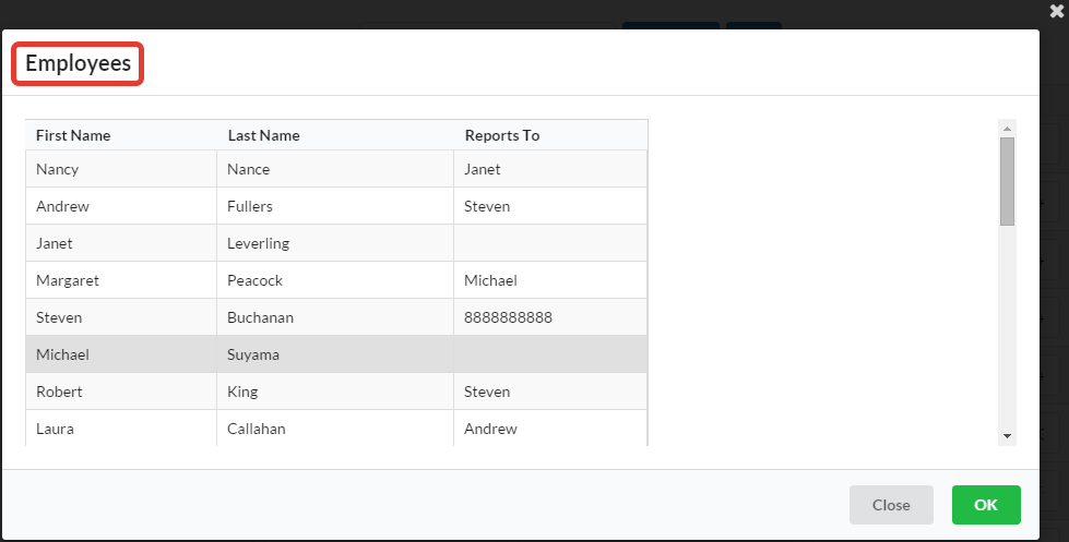
The title of the Windows that are opened from a LookUp-have installed in the property title component lookup-field in the template corresponding edit form. For example, the template edit form employee.hbs embedding a LookUp-and can look like the following:
{{lookup-field/lookup-field
  choose='showLookupDialog'
  remove='removeLookupValue'
  value=model.employee1.firstName
  relationName='employee1'
  projection='EmployeeL'
  title='Employees'
}}
As a result, the title of the properties title component lookup-field will be displayed in a modal window, available for LookUp here:
Configure filtering and the number of elements on the page
Settings filter and/or the number of elements on the page through the event getLookupFolvProperties in the controller of the form:
getLookupFolvProperties: function(options) {
    //...

    if (methodArgs.relationName === 'type') {
    return {
        filterButton: true,
        filterByAnyWord: true,
        enableFiltres: true,
        refreshButton: true,
        perPage: 25,
      };
    }

    // ...
}
filterByAnyWord or filterByAllWords), so LookUp the form to use you may only use one of them.Next, specify the event in the template nastraivanie for LookUp list:
{{flexberry-lookup
    // ...
    lookupWindowCustomProperties=(action 'getLookupFolvProperties')
}}
The implementation displayed on ember-stande.
Configuring the hierarchy
In the controller editor to specify:
export default EditFormController.extend({
  actions: {
    getLookupFolvProperties(options) {
      if (options.relationName === 'type') { // Property LookUp-and.
        return {
          // Whether to show the toggle button in the hierarchy, if the hierarchy for a list of available
          // (if false, the button is displayed)
          disableHierarchicalMode: false,

          // Activate the hierarchy when you load a lookup-form.
          inHierarchicalMode: true,

          // A property on which to build the hierarchy.
          hierarchicalAttribute: 'Name',
        };
      }
    },
  }
});
Specifying a limit function
Setting limits on the values displayed in the list for selection, carried out by setting the filter using the customer query language. This filter is defined as a function in the property lookupLimitPredicate when specifying the template.
{{flexberry-lookup
  lookupLimitPredicate=lookupCustomLimitPredicate
  // ...
}}
Consider the assignment constraints for example. Let the entity have Employee artisans link Employee1 type Employee. Require a LookUp to display only those records that have a FirstName FirstName greater than or equal to the current selected record.
PstrfEmployee` model has the following form:
var Model = BaseModel.extend({
  firstName: DS.attr('string'),
  lastName: DS.attr('string'),
  birthDate: DS.attr('date'),
  employee1: DS.belongsTo('employee', { inverse: null, async: false }),
});
In the controller type Employee create a calculated property lookupCustomLimitPredicate, which will return the filter to “show only those records that have a FirstName FirstName greater than or equal to the current selected record”.
export default EditFormController.extend({
  // The Caption of this particular edit form.
  title: 'Employee',

  /**
* Current function to limit the accessible values of model employee1.
*
* @property lookupCustomLimitPredicate
* @type String
* @default undefined
*/
  lookupCustomLimitPredicate: Ember.computed('model.employee1', function() {
    let currentLookupValue = this.get('model.employee1');
    if (currentLookupValue) {
      let currentLookupText = this.get('model.employee1.firstName');
      return new StringPredicate('firstName', Query.FilterOperator.Ge, currentLookupText);
    }

    return undefined;
  })
});
Next, the appropriate property must be specified in the form template:
{{flexberry-lookup
  lookupLimitPredicate=lookupCustomLimitPredicate
  // ...
}}
Example set of constraints in the row GE on the elements of the row
If there is a need to limit lookup the value of the element in GroupEdit in the same line, this can be done using lookupAdditionalLimitFunction.
  getCellComponent(attr, bindingPath, model) {
    let cellComponent = this._super(...arguments);
    if (attr.kind === 'belongsTo') {
      switch (`${model.modelName}+${bindingPath}`) {
        case 'ember-flexberry-dummy-vote+author':
          cellComponent.componentProperties = this.get('lookupDynamicProperties');
          break;      }
    }
    return cellComponent;
  }
});
  lookupDynamicProperties: Ember.computed(function() {
    ...
    lookupAdditionalLimitFunction = function (relationModel) {
      return new StringPredicate('eMail').contains(relationModel.get('voteType'));
    };

    return {
      ...
      lookupAdditionalLimitFunction
      ...
    };
  })
In this example, the objects displayed are limited to lucapa field GroupEdit ‘voteType’ value master ‘eMail’. relationModel.get(‘…’) - model, for which lucapa edited master.
lookup-events service capabilities
The service allows you to subscribe to the following events:
| Name | Description |
|---|---|
lookupDialogOnShow |
Called when a modal starts to show. |
lookupDialogOnVisible |
Called after a modal has finished showing. |
lookupDialogOnHidden |
Called after a modal has finished hiding. |
lookupOnChange |
Called when lookup value changed. |
lookupDialogOnDataLoaded |
Called when data for lookup are loaded. |
An example demonstrating how you can subscribe to an event:
import { inject as service } from '@ember/service';

//...

  /**
    Service that triggers lookup events.

    @property lookupEventsService
    @type Service
  */
  lookupEventsService: service('lookup-events'),

//...

// Subscribe
this.get('lookupEventsService').on('lookupDialogOnHidden', this, this._refreshDimmer);

// Subscribe
this.get('lookupEventsService').off('lookupDialogOnHidden', this, this._refreshDimmer);
Dropdown mode
In order for the lookup to function in the dropdown mode, you need to set the ‘dropdown’ property to ‘true’. There are also some settings for this mode:
| Name | Description | Default value |
|---|---|---|
dropdown |
Flag to show that lookup is in dropdown mode. | false |
dropdownIsSearch |
Flag to show that lookup has search or autocomplete in dropdown mode. | false |
dropdownSettings |
Semantic-ui settings for dropdown. | undefined |
dropdownClass |
CSS classes for flexberry-lookup at dropdown mode. | undefined |
You can define values for properties in a template. For example:
{{flexberry-lookup
    // ...
    dropdown=true,
    dropdownIsSearch=false,
    dropdownSettings=(hash direction="upward")
}}
The implementation is displayed on ember-stand.
Setting the default sort
The implementation is displayed on ember-stand.
Lookup with autocomplete
Autocomplete in LookUp-e allows keyboard entry of the value and subsequent selection of the proposed options.
To translate the LookUp mode to completion, you need to add a property autocomplete:
{{flexberry-lookup
  autocomplete=true
  // ...
}}
Below are attached to LookUp properties for work completion.
| Property | Description | Default value |
|---|---|---|
autocomplete |
Mode autocomplete, in the “read-Only” doesn’t work | false |
minCharacters |
Minimum number of characters to autocomplete mode autocomplete and in the mode drop-down list | 1 |
maxResults |
Maximum number of records displayed in autocomplete mode and in the mode in the mode drop-down list, not required property | 10 |
autocompleteProjection |
Name of the projection which reads the fields in the query to display the records, not a mandatory property is used for calculated fields | undefined |
autocompletePersistValue |
a Flag to control whether to leave or not the entered value when focus is lost, if the results autocomplete was not selected no value | false |
The imposition of the sort the hidden fields of the wizard
If there is a need for sorting hidden fields when using auto-completion, you should use a property autocompleteOrder. To this end, the application template, you must add this property to specify the fields by which to sort and the sort direction. For example:
autocompleteOrder="moderated asc, parent desc"
Mode autocomplete with automatic selection according to the value entered
In this mode:
- While typing in auto-completion of values that is not in the directory, it is not reset, but is set to an empty reference to a dictionary.
- While typing in auto-completion values, which is in the directory, set the reference to the dictionary.
This can be useful if entered in the LookUp value to be stored in a separate field, even if the dictionary LookUp-but this value is not.
To enable this mode, you should autocompletePersistValue property is set to true and the property displayValue bind on the field to which you want to save displayed in the LookUp-e value.
{{flexberry-lookup
  ...

  autocomplete=true
  autocompletePersistValue=true
  displayValue=model.lookupDisplayValue
}}
AutoFill values in a LookUp.
Autocompletion allows you to substitute a suitable condition value.
To SkyCity autocompletion in the LookUp-e, you want to add a property autofillByLimit and specify the limit function in lookupLimitPredicate:
{{flexberry-lookup
  autofillByLimit=true
  lookupLimitPredicate=lookupLimitPredicate
  // ...
}}
In this case, if the specified restriction corresponds to only one object, then it will be immediately installed. If you previously selected a different value, autocomplete will replace it, but only if the limitation corresponds to a single object.